
Happy new year everyone!
At Whitetruffle, we’re really excited about 2015, and we decided to start the year with a full revamp of our desktop application. We’ve listened to many of the suggestions that companies and candidates sent us, and worked really hard to come up with an improved layout. Next time you login in Whitetruffle, you’ll experience the new version.
So what did we do?
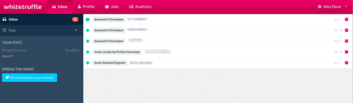
We unified the inbox. Your inbox is what you should pay attention to. It includes:
- New matches
- Matches with a message that need your response
- Introductions for which you need to introduce yourself
- And for paying subscribers, suggestions among our top candidates
The type of matches is easily identifiable by icons on the left of the match.
We also made the menu simpler. Now, it’s either “Inbox” or “Past”. Much, much easier to navigate.
If you’re part of the many people who are actually using Whitetruffle on your phone or tablet, you’ll notice huge improvements. We have many more news to come in that space, but we think you’ll love the new version on your mobile device.
We’ve also made many performance improvements. Some of you experienced browser specific bugs and delays, and we were able to identify most of those problems and fix them.
Last but not least, you’ll see that the site is cleaner, and it’s much easier to get the info you need to make those big decisions.
There you go – we’re really excited about all this. We actually have many more announcements coming and some great new features. Stay tuned!